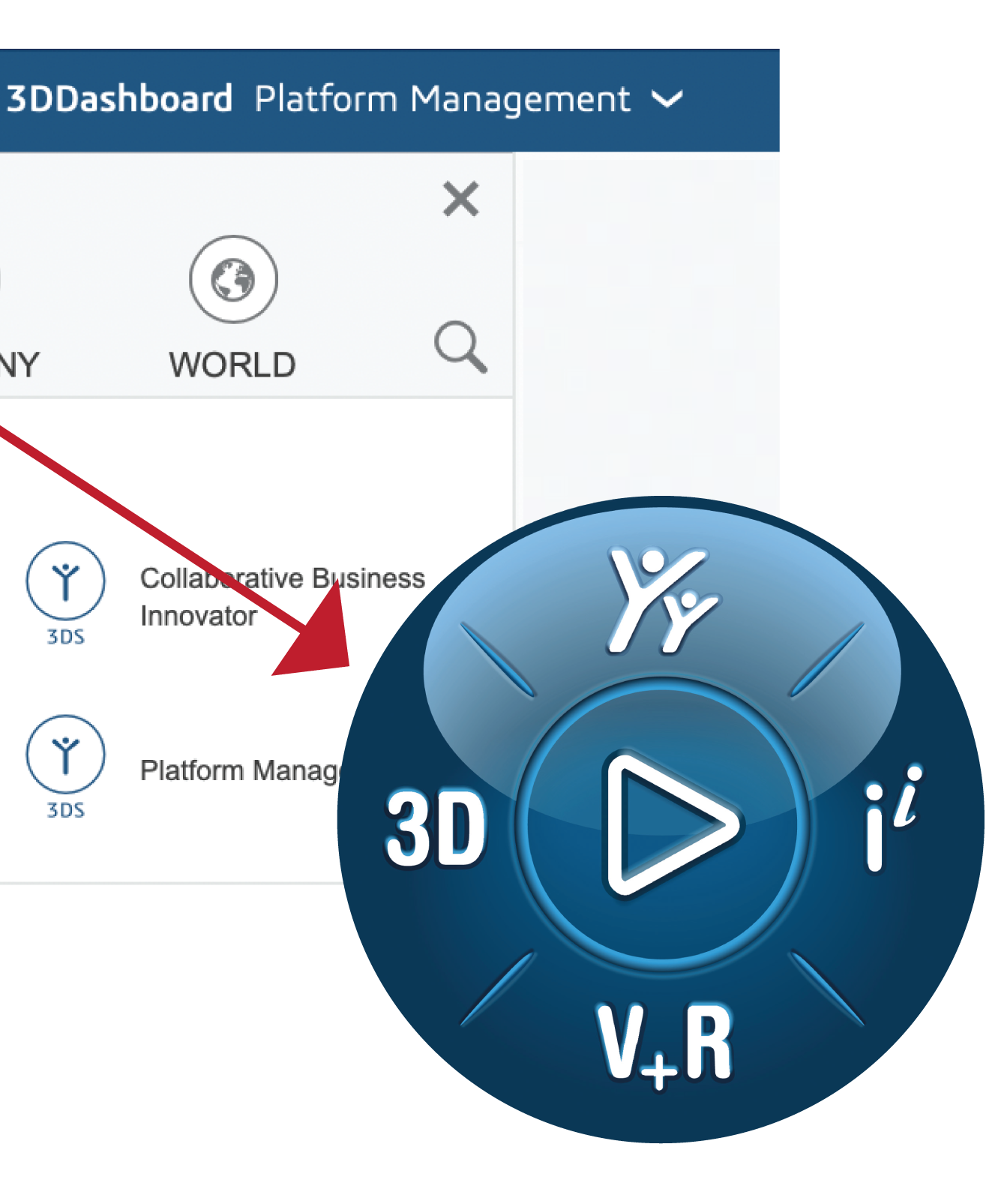
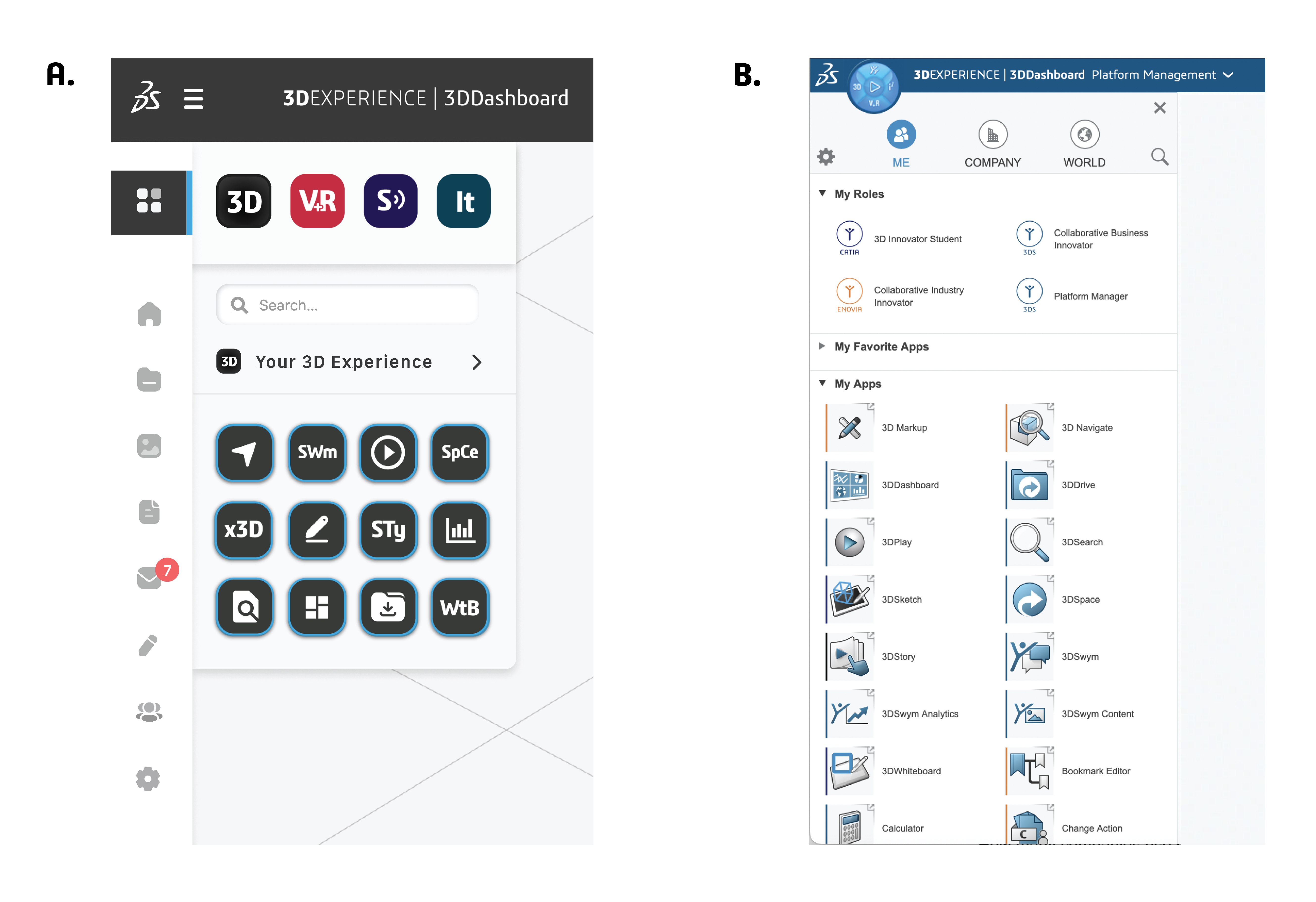
My sketches for this interface redesign were primarily focused on how to make navigation of the 3DEXPERIENCE apps more intuitive. Specifically, the navigation compass that looks like a blue play button in the upper lefthand corner of the dashboard.
Sketches & Concept Validation

When first navigating the platform, it took a long time to realize that the play button in the upper right hand corner was the main way to navigate from the landing dashboard to the 3D apps which are the cornerstone of the service.
02
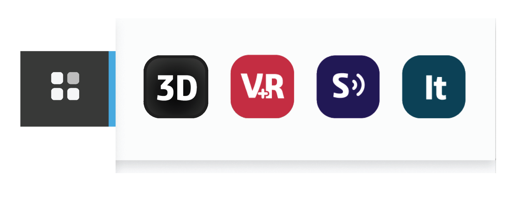
The 3DEXPERIENCE app icons were modified to be reminiscent of Apple and Adobe icon systems, this is because the majority of users today are familiar with these visual associations.
Main Navigation & Tool Bar Solution

The compass play button was replaced by the application icon located in the top left navigation bar. The main app icon in the side bar both opens and collapses the app navigation window. This offers more flexibility to increase the usable screen space if designing in app, but allows easy access to navigation if needed.
The app button then expands into the four separate verticals. These icons then make it very clear which aspect of the platform you are navigating. Furthermore, the simplified icon branding will make it easier for a user to visually remember and navigate to the desired products.


